This business is for sale.
Contact us for more details.
Blog
Add article
Ask
Envato Support
Resources
WordPress
1000+ Emojis
1000+ Icons
Infinito
Home
7 October 2020
0 Comments
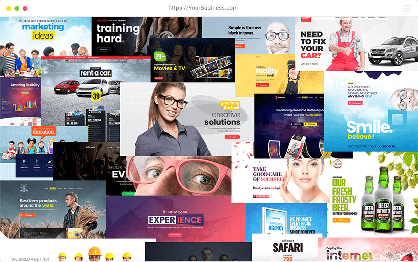
A Theme With 46 Ready to Use Demos With 1 Click.
Related
posts
0
Unlock Incredible Sales: The Art of Designing a Magnetic Book Cover
Derek Murphy
Design
0
The Art of Grammar, Rhetoric, and Characterization in Business Storytelling
Derek Murphy
Uncategorized
Latest posts
Ultimate Beginners Guide – Start a WordPress Blog in 15 Easy Steps
26 Nov 2019
Unlock Incredible Sales: The Art of Designing a Magnetic Book Cover
11 Mar 2024
The Art of Grammar, Rhetoric, and Characterization in Business Storytelling
14 Jan 2024
Tags
alt tag
alt text
backlink
blocks
blog
blog post
boost
categories
comments
content
content upgrade
cover image
dashboard
display
facebook
features
free
google
Gutenberg Block Editor
how to
images
instagram
LinkedIn
link juice
marketing tools
monetize
plugins
post
psd
SEO
social media
statistics
template
theme
tips
tutorial
twitter
URL
website
wordpress
wordpress.com
wordpress.org
wordpress plugins
wordpress themes
YouTube
This website uses cookies. By using and further navigating this website you accept our
privacy policy
and
terms and conditions
. Detailed information about the use of cookies on this website is available by clicking on
cookie settings
.
Accept
Privacy settings
×
×
Privacy Cookie Center

