
If you’re a designer, you already know: color is everything. It sets the tone, creates the mood, and instantly communicates what your brand or design is all about. In 2025, color palettes are going bold, expressive, and deeply connected to the cultural vibe of the moment.
But it’s not just about being trendy—it’s about being intentional. The right color palette can make your designs feel modern and relevant while still staying true to your brand’s personality.
In this article, I’ll take you through the top trending color palettes and aesthetics for 2025, complete with examples, design tips, and ideas for how to use them in your work. Whether you’re designing websites, logos, or social media graphics, this is your cheat sheet to staying ahead of the curve.
Why Color Trends Matter
Before we dive into the specifics, let’s talk about why keeping up with color trends is important.
- Cultural Relevance: Color trends reflect what’s happening in the world—think of them as visual snapshots of our collective mood.
- Freshness: Using current color palettes keeps your designs from feeling dated or out of touch.
- Audience Connection: People respond emotionally to colors. Using trending shades can help you connect with your audience on a deeper level.
The Top Color Palettes and Aesthetics for 2025
Here’s what’s making waves in 2025, from bold and experimental to soft and serene.
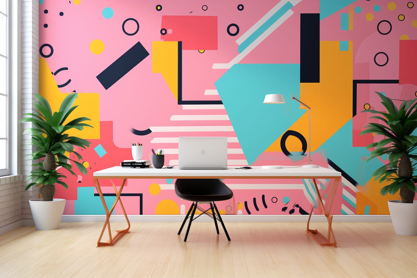
1. Hyperbright Electric
Think neon vibes meet 80s nostalgia, but with a futuristic twist. This palette is all about intensity, with electric pinks, lime greens, and vivid purples that feel almost alive.
Key Colors:
- Electric Pink (#FF007F)
- Neon Green (#39FF14)
- Digital Purple (#7A00FF)
Where to Use It:
- Cutting-edge tech brands or apps.
- Event posters or nightclub promotions.
- Gen Z-focused marketing.
Pro Tip: Pair hyperbrights with stark black or white for maximum impact.
2. Organic Earth Tones
In a world that’s becoming more eco-conscious, earthy palettes are thriving. Think warm terracottas, sage greens, and muted mustards that feel grounded and timeless.
Key Colors:
- Terracotta (#E07A5F)
- Sage Green (#84A98C)
- Mustard Yellow (#F4A261)
Where to Use It:
- Sustainable brands or wellness products.
- Interior design or lifestyle content.
- Outdoor adventure companies.
Pro Tip: Add texture (like grainy effects) to make these tones feel even more natural.
3. Soft Digital Pastels
This aesthetic feels like a breath of fresh air—gentle pinks, blues, and lavenders that are inspired by early internet nostalgia and dreamy minimalism.
Key Colors:
- Powder Blue (#B0E0E6)
- Lavender Mist (#E6E6FA)
- Millennial Pink (#F8BBD0)
Where to Use It:
- Beauty brands or fashion lookbooks.
- Feminine, whimsical website designs.
- Lifestyle influencers’ social media graphics.
Pro Tip: Combine soft pastels with clean, sans-serif fonts for a modern, airy look.
4. Bold Metallics
In 2025, metallics are making a comeback—think shiny gold, rose gold, and brushed steel. They add a sense of luxury and sophistication.
Key Colors:
- Rose Gold (#B76E79)
- Brushed Steel (#8A8D91)
- Rich Gold (#FFD700)
Where to Use It:
- Premium product packaging.
- High-end fashion or jewelry brands.
- Modern business cards or branding.
Pro Tip: Use metallic accents sparingly to avoid overwhelming the design.
5. Muted Retro Hues
Inspired by the 70s and 80s, this palette blends nostalgia with subtle modernity. Expect muted oranges, browns, and dusty blues that feel familiar yet fresh.
Key Colors:
- Rust Orange (#C36241)
- Dusty Blue (#A9C0CE)
- Beige (#F5F5DC)
Where to Use It:
- Vintage-inspired clothing lines.
- Coffee shop branding or restaurant menus.
- Editorial layouts.
Pro Tip: Pair retro hues with serif fonts for a true vintage vibe.
6. Monochrome Minimalism
This trend leans on simplicity and elegance, with black, white, and shades of gray dominating the scene. It’s all about understated sophistication.
Key Colors:
- Deep Black (#000000)
- Light Gray (#D3D3D3)
- Pure White (#FFFFFF)
Where to Use It:
- High-end fashion brands or portfolios.
- Minimalist websites.
- Corporate branding.
Pro Tip: Add subtle gradients or textures to make monochrome designs more dynamic.
How to Choose the Right Palette for Your Project
Picking the perfect palette isn’t just about what’s trendy—it’s about what fits your brand or project. Here are some tips to help you decide:
- Know Your Audience: Bright neon might grab Gen Z’s attention, but muted earth tones might resonate more with eco-conscious millennials.
- Consider the Context: Where will your design live? A digital poster and a product label have very different requirements.
- Test Before You Commit: Mock up your design with different palettes and see how they feel. Sometimes what looks good on paper doesn’t translate well in practice.
FAQs About Color Palettes and Design Trends
Q: How often should I update my brand’s color palette?
A: It depends on your brand. If your colors feel outdated or no longer resonate with your audience, it might be time for a refresh. Otherwise, stick with what works.
Q: Can I mix multiple trends?
A: Absolutely! Just make sure the colors work well together and don’t overwhelm the design.
Q: Where can I find inspiration for color palettes?
A: Check out resources like Coolors, Adobe Color, or even Pinterest for endless ideas.
Final Thoughts
Color trends come and go, but the key is using them intentionally. The best designs don’t just follow trends—they adapt them to tell a story, evoke emotion, and connect with the audience. Whether you’re embracing hyperbright neons or soft pastels, the most important thing is to stay true to your brand’s identity.
What about you? Which of these palettes are you excited to try in 2025? Let me know—and share your favorite color combos. I’m always on the hunt for inspiration!


No Comments