
Still in shape, after 10 years of service
It’s old, but…?
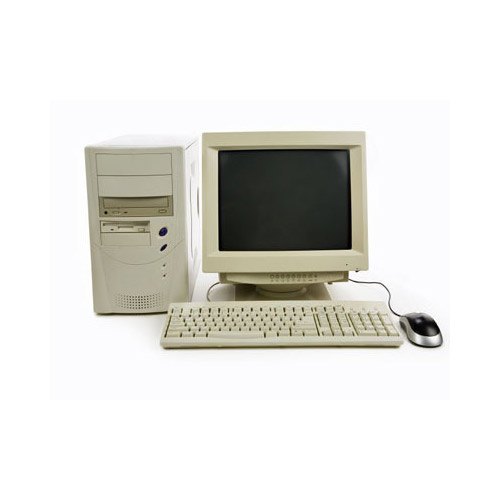
Maybe some people consider this technique old, it is from the days the PC looked like this. It’s true, but on the other hand, being so old it is supported on many browsers, going way back to the Internet Explorer 8. It is also rendered faster than its bulling brother Flexbox.
With a few tips and tricks, aligning html content using the old and famous display: table is easy and hey, no -webkit prefix needed.
Simple example
For the ones that are not so familiar with display: table, here is the basic example:
Here is the HTML:
<div class="parent">
    <span class="first">First</span>
    <span class="second">Second</span>
    <span class="third">Third</span>
</div>
Here is the CSS( without some background colors and width ):
.parent{
  display:table;
}
span{
  display:table-cell;
  vertical-align: middle;
}As you can see all text is align middle, but you can go top or bottom for individual cell or for all.
.parent{
  display:table;
}
span{
  display:table-cell;
}
.first{
   vertical-align: top;
}
.second{
   vertical-align: middle;
}
.third{
   vertical-align: bottom;
}If you want to align text on center just use text-align:center.
Complex example
Now let put it in real action, let do something real and helpful: a logo, a dynamic sized search input and a button, aligned vertical on center(middle). See the image bellow.

Let’s start!
<div class="parent">
   <div class="holder">
       <a class="logo">
          <img src="https://wowlayers.com/wp-content/uploads/2019/10/logo.png">
       </a>
   </div>
   <div class="holder">
       <input type="text" placeholder="search input">
   </div>
   <div class="holder">
       <button type="button">Menu</button>
   </div>
</div>
<style>
.parent{
display:table;
width:100%;
}
.parent .holder{
display:table-cell;
vertical-align: middle;
}
</style>The result from our code is:
It is close to what we are looking for, but not ready. You can the display: table auto-arrange mode and although the div is 100% the button is not align on the right and the input is not on middle as it should be.
Take control: tips to align horizontal
As you can see in the test example above, we have middle(center) vertical alignment, but our horizontal blocks are not in the place we want.
The logic: for the fixed blocks, add width:1px( logo and button ). As a result, the browser will do its widths to 100% of the block and not larger. As input tag doesn’t have 1px, it should stretch to fill the difference in the space.
The new code:
<div class="parent">
   <div class="holder" style="width:1px">
       <a class="logo">
          <img src="https://wowlayers.com/wp-content/uploads/2019/10/logo.png">
       </a>
   </div>
   <div class="holder">
       <input type="text" placeholder="search input">
   </div>
   <div class="holder" style="width:1px">
       <button type="button">Menu</button>
   </div>
</div>
and the result:
I feel like something is not right. Oh wait, the logo is gone. Why? Because the img tag has max-width:100%, a common use to make images resposive.
The solution:
.parent img{
   max-width: none;
}
Final code!
Let’s put all together and remove those inline styles and see what happens:
<div class="parent">
   <div class="holder width_1px">
       <a class="logo">
          <img src="https://wowlayers.com/wp-content/uploads/2019/10/logo.png">
       </a>
   </div>
   <div class="holder text_align_center">
       <input type="text" placeholder="search input">
   </div>
   <div class="holder width_1px">
       <button type="button">Menu</button>
   </div>
</div>
<style>
.parent{
display:table;
width:100%;
}
.parent .holder{
display:table-cell;
vertical-align: middle;
}
.parent .logo img{
max-width: none; /* fix for max-width: auto; */
}
.parent input{
width:80%
}
.text_align_center{
text-align:center /* align input on center */
}
</style>and the results…
If you need to align top or bottom, right or left, just go with it. I really thought that aligning on center will be the most common, but hey, sometimes you got you do what you have to.
Conclusions
Although there is no way you can choose the blocks order, there is a little trick to reverse them: use direction:rtl
Pros
- Fast rendering
- good browser support
- no -webkit prefix
Cons
- no blocks order
- often must use it with some tricks
So, do you use it or not? I used it hundreds of times and if my projects are more on the simple and fast side I still do.


No Comments