

Have you ever been confused about what font should you choose for a particular project? There’s no wonder, considering there are more than half a million fonts actuality (approx. 550,000+ fonts).
Almost any project, any design or website will involve the art of playing around with fonts. It’s a fact that fonts can help set a mood that can be easily transferred to your readers through the message and impression of the text.
But how do you know what font suits best your project? Practice, practice, practice, experiment.
So, if you’ve ever felt lost when it comes to fonts, you’re in the right place. This guide will offer a comprehensive summary of fonts: what types of fonts are, how to choose them and even where to find free fonts to download.
What types of fonts are out there?
You might hear that some people like typographers are interested in the history of typography, each with their own historical and technical definitions, which means many classifications.
To clear things up, let’s chit-chat a bit about four basic font categories that will be useful to understand when choosing a font, or even when combining more fonts.
- Serif Type Styles:
- Old style– this category includes the first Roman type, the axis of curved stroke is inclined to the left;
- Transitional– these typefaces represent the transition between old style and neoclassical design;
- Neoclassical– the contrast between thick and thin strokes is abrupt and the axis of curved stroke is vertical;
- Slab– these typefaces have heavy serifs with minimal or no bracketing
(bracket= curved or wedge-like connection between the stem [a.k.a. stroke] and serif of some fonts); - Clarendon– their stroke contrast is light and tends to be short to medium length;
- Glyphic– the contrast in stroke weight usually at a minimum and the axis of curved strokes tends to be vertical;
- Sans Serif Type Styles:
- Grotesque– characterized by low contract, an average slope, and even widths;
- Square– these fonts are designed with straight lines and very little curvature;
- Geometric– these strokes have the appearance of being monolines and character shapes are made up of geometric forms;
- Humanistic– characterized by the presence of the hand, and uppercase similar in proportion to the Roman capitals, having a true italic (cursive font based on calligraphic handwriting) rather than a sloped roman (oblique type).
- Script Type Styles:
- Formal– many characters have strokes that join them to other letters;
- Casual– these typefaces are designed to suggest informality, appear to have been drawn with a brush;
- Calligraphic– they mimic calligraphic writing and appear to have been written with a flat-tipped writing instrument;
- Blackletter & Lombardic– these typefaces are patterned on manuscript lettering.
- Decorative:
- this is the largest and also the most various category, they frequently reflect an aspect of culture (such as tattoos, graffiti, etc).
Font or typeface?
Wonder if these two terms mean the same thing? Well, technically, they’re different. The typeface is the design and the font is how that design is given. A font is what you use, a typeface is what you see.
So, typeface+style+size=font.
Why choosing a suitable font matter?
Based on what you wear, what you talk about, people might make hypotheses about you, about your style or you can make that good impression you want so bad.
Font choices serve the same purpose in design, and often sets the tone, the mood for the whole project, influencing viewers’ feelings towards your design.
So be careful when you choose your desired font, don’t be that guy who gives viewers an excuse to make incorrect theories about your brand, your business.
How to choose a proper font?
Brainstorming
Before you even start looking forward through fonts that you already have or searching for new ones, it would be a clever idea to brainstorm some of the qualities you want your design to deliver.
This is important because every single typeface has its own personality, just like human beings. You need to figure it out first, what a particular font is saying to you if it fits your design, your ideas.
If you find yourself off track, just ask yourself this question: Will this font I’ve chosen actually work for me?
It is readable?
Depending on your project, you may find that some fonts are more suitable than others, for example, a business card will need a font that’s easy to read even at a small size. If you’re not sure and you have some doubts, whether a font is suitable for you, just pick a more neutral font.
Readability becomes an important quality to look for in a font, for that reason, here are some ways fo figure out if your text is readable:
Size– make sure you choose the right size (how to test to see if the size is right- open any word software, type a few lines using the font you want to work with and reduce its size. If you can read it, then it will probably perform well on small screens).
Spacing– in general, large spacing improves readability, but if you’re lack of space, you’ll need to experiment with different combinations of fonts sizes and spacing to optimize readability.
Licensing
Always check the license of the font, whether you want to buy it or download it. Usually, it can be licensed for personal use (if the font is free), commercial or educational use. Protect yourself and/or your client, by reading carefully the license they provide.
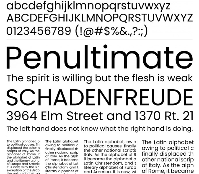
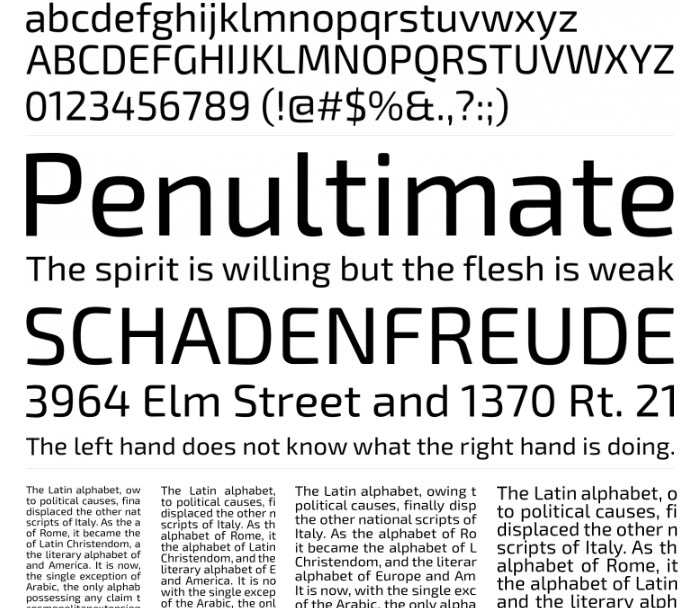
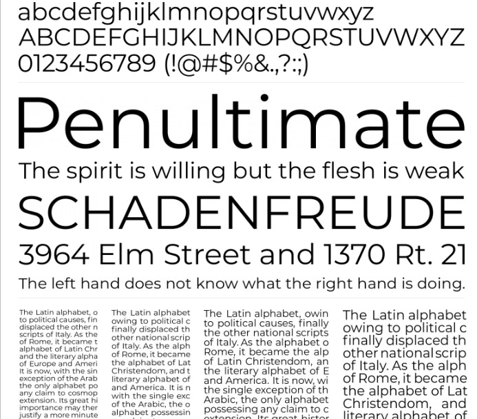
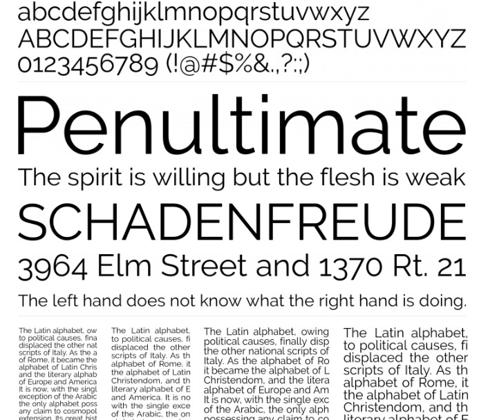
Most common used fonts
Roboto
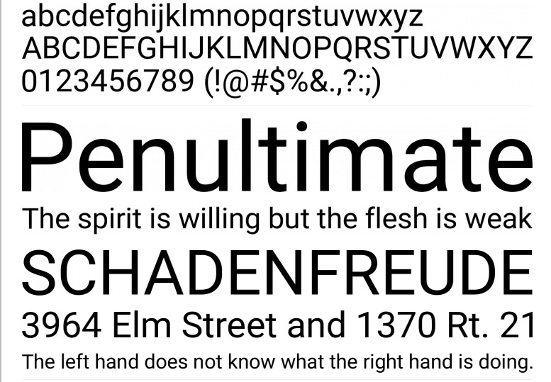
Roboto is featured in more than 31,000,000 websites.
FYI- We are also using this font.
Bebas Neue
Bebas Neue has been downloaded over 10,000,000 times. Including other sites, it is more than 50M.
Space Grotesk
Space Grotesk was released as a free font under the SIL Open Font License and is available in five weights without italics.
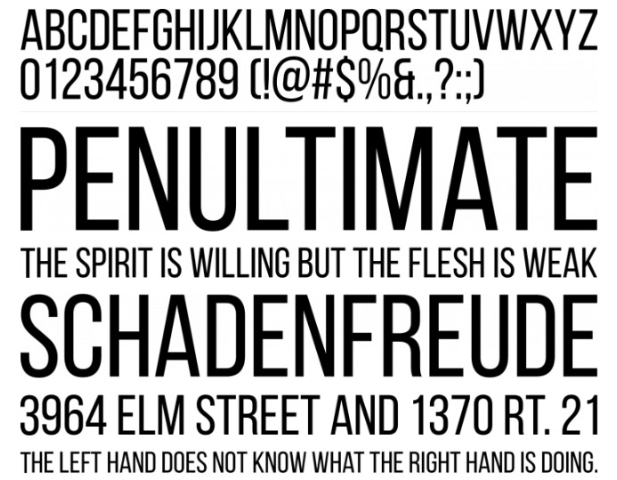
Oswald
Oswald is featured in more than 5,900,000 websites.
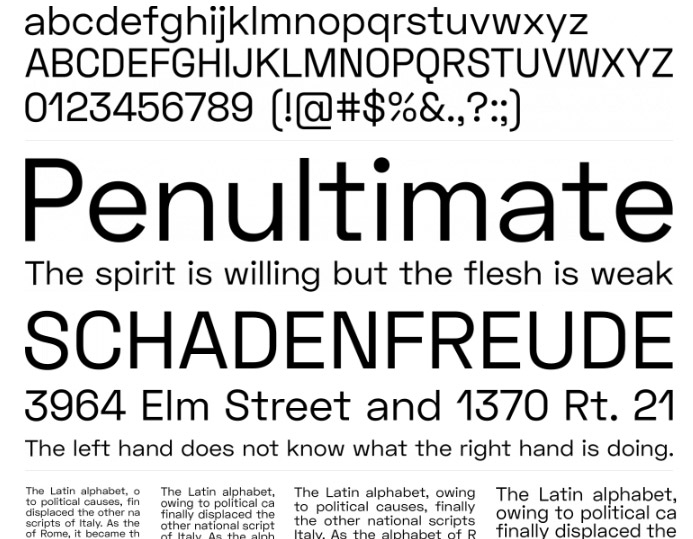
Poppins
Poppins is featured in more than 3,700,000 websites.
Exo 2
Exo 2 is featured in more than 480,000 websites.
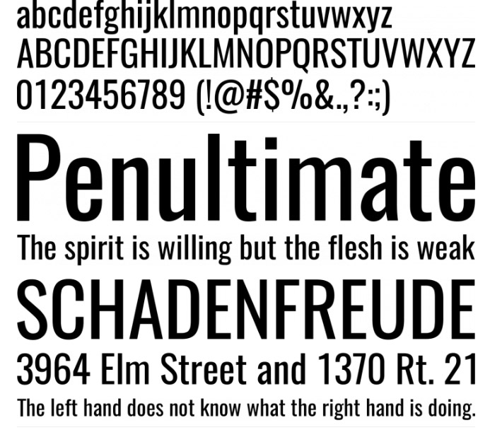
Montserrat
Montserrat is featured in more than 8,400,000 websites.
Raleway
Raleway is featured in more than 6,100,000 websites.
Ubuntu
Ubuntu is featured in more than 1,900,000 websites.
Playfair Display
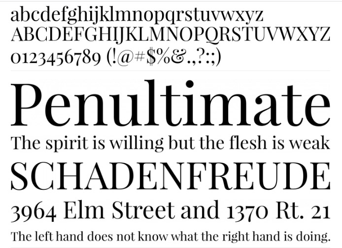
Playfair Display is featured in more than 4,400,000 websites.
American Captain
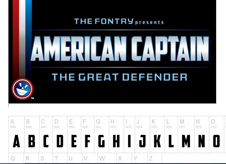
American Captain is now available in commercial form as a 6-FONT FAMILY with complete character sets and language support for Central European characters, Cyrillic, Greek, and Hebrew.
Circular Std
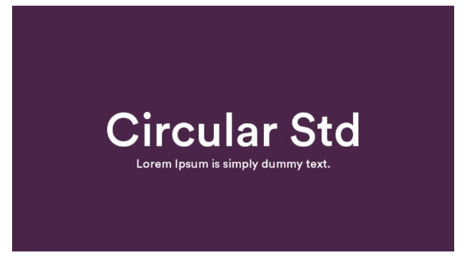
Circular Std font used to be designed with daring headlines and massive type settings in mind. It is a quality sans-serif font with strong geometric types. You should utilize it for web sites, prints, and so forth.
Gilroy
Gilroy is a modern sans serif with a geometric touch. It comes in 20 weights, 10 uprights, and its matching italics. The Light & ExtraBold weights are free of charge, so you can use them to your heart’s content.
Helvetica New
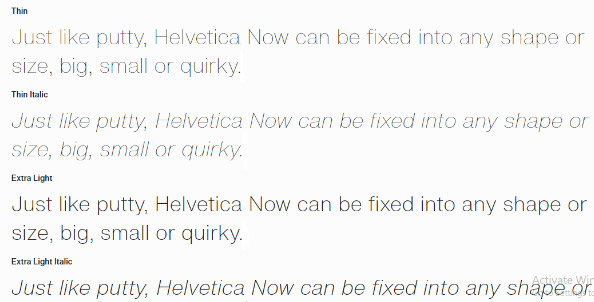
Every single glyph of Helvetica has been redrawn and redesigned for this expansive new edition.
Basier Circle
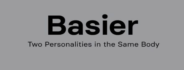
This is a classic style sans serif typeface that has been modernized with its unique curves and cut-ins making it one of the most memorable caps fonts on the market.
Cera Pro
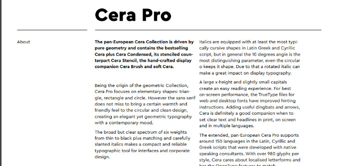
Cera Pro’s six weights, slender to black, give it a complete array of expression for interfaces and company structure; in print, on-screen as well as in many languages.
With that being said, my dearest readers, I’ve tried my best to come up with these noteworthy fonts that you can use, but remember that the most important part, before choosing a font is to read the license from top to bottom.
Have I missed a font, maybe more? Hit me with your comment, let me know if I did.
Let’s be creative and awesome together.


No Comments